My final decision whether to release my EP or not is that I won’t be releasing it. The reason for this is fairly simple. I have a music instagram account that I post Drill or HipHop beats on. This is not an account that I want to associate with my EP as it is a producer account under the name ‘Obey The Producer’. This is because it just doesn’t fit the genre and audience. It will most definitely not go down well or receive much attention due to these factors. Unfortunately, due to my bad time scheduling, I was unable to work on promotion or social media advertising for this EP as it would’ve prevented me from completing a significant part of my practical work.
In addition to this, I also want to work on a few other songs and release them as an album in the future once I’ve worked on my social as myself, Conor Walker. However, this does not mean I won’t be working on my cover art and presentation of my FMP and plan to use this time to create some songs that I am proud of. For now the songs will be limited to just my WordPress.
Cover Art:
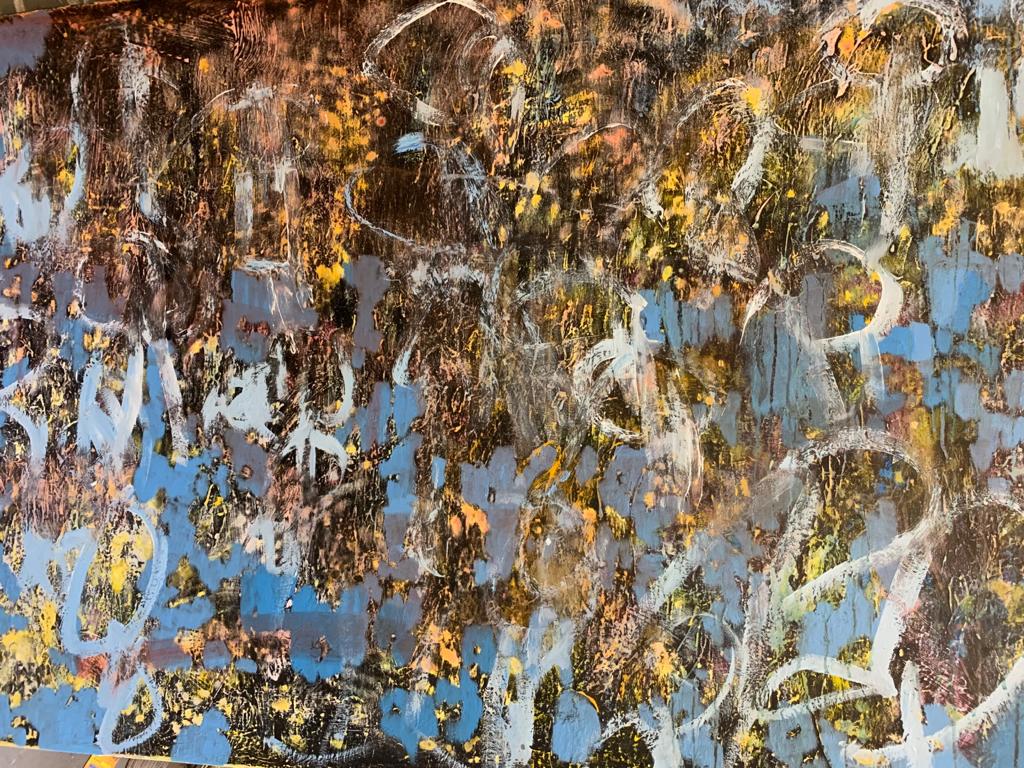
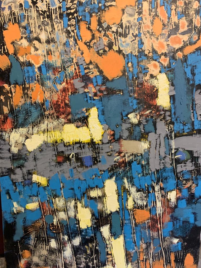
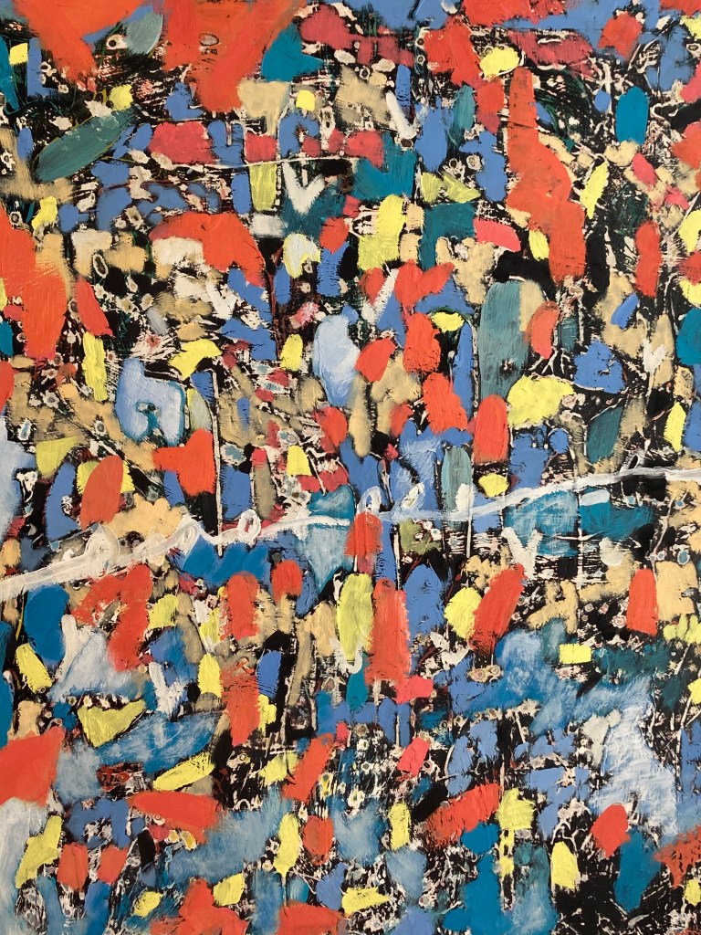
For the EP cover art, I will be using one of my dad abstract paintings. I really love his style of of work and I think that they perfectly fit not only the theme of the songs but it coincides with the fully ‘Acoustic’ element. This way everything in the EP was done by hand and fully original. I’m going t0 gather a bunch of photos of some of his work that I like, decide a couple that I think are good. Them i’m going to run them through a photo editor, and mess around with the colour. I’m going for an abstract theme to fit the songs.
Heres a few paintings I like the look of:
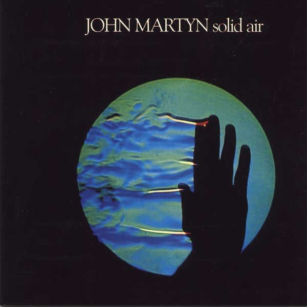
This is the cover art of a favourite artist of mine. I really love the simplistic look and especially the colours. I what I do want to find is a font that mimics the style seen in this. Its a simple 70’s style font that I think will fit my cover perfectly. I went onto 1001 fonts.com to find a 70’s inspired font. I found a font called ‘Peignot Regular’
My cover art:
This one directly above is by far my favourite. For some reason WordPress won’t support a HEIC image. So I had to covert it to JPEG using ‘Imazing converter’. This made the imagine a pretty bad quality. However, I can edit the photo in HEIC then screenshot the final product.
fortunately I didn’t need to use the JPEG image. I downloaded Fotor Photo editor off the App Store and used it to sharpen up the HEIC Image. I then also added the text font that I had downloaded and used the John Martyn cover as inspiration for the text layout.
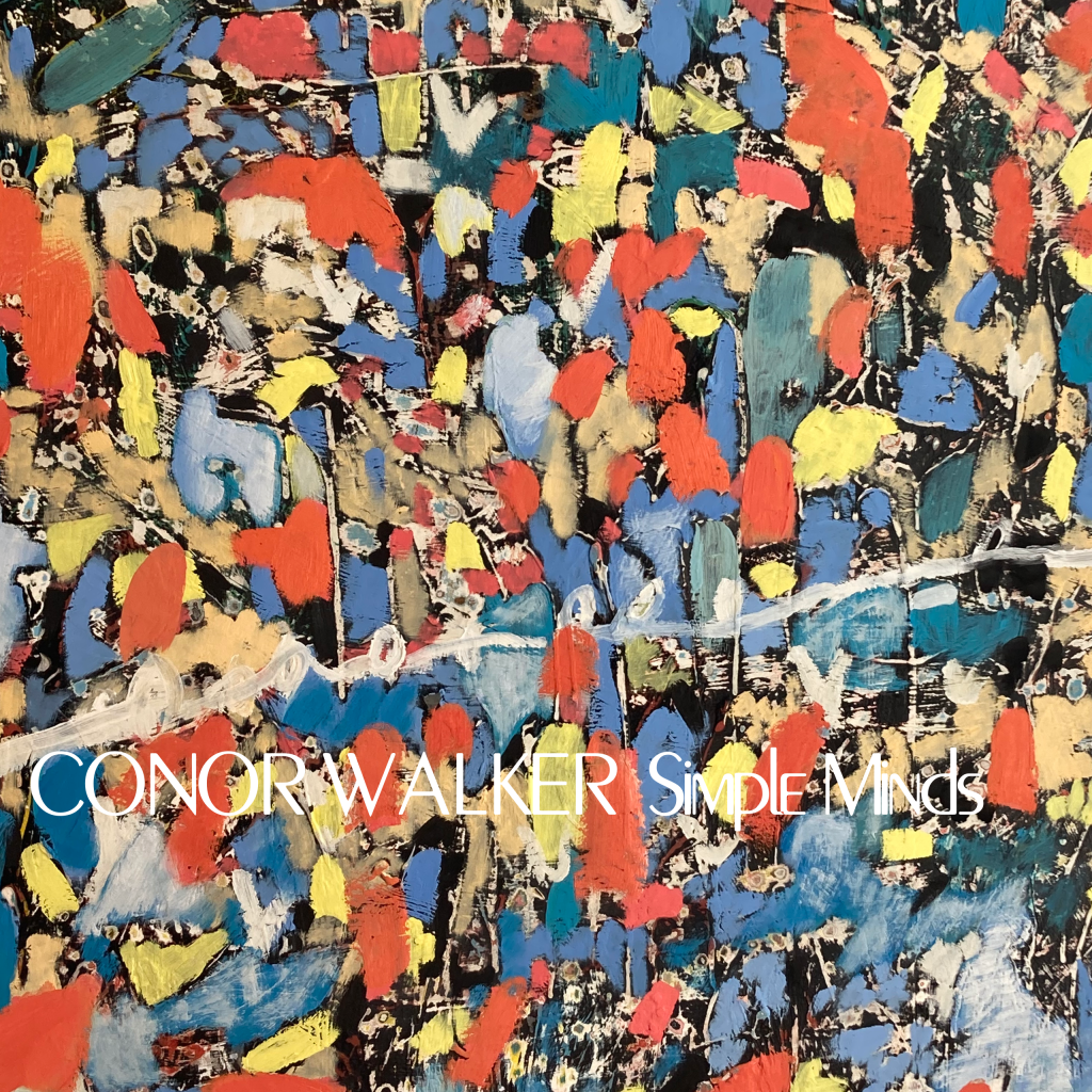
It looks good but some of the colours may be too bright for underneath the white text. However, No other coloured text looks good. So I’ll have to work around it.
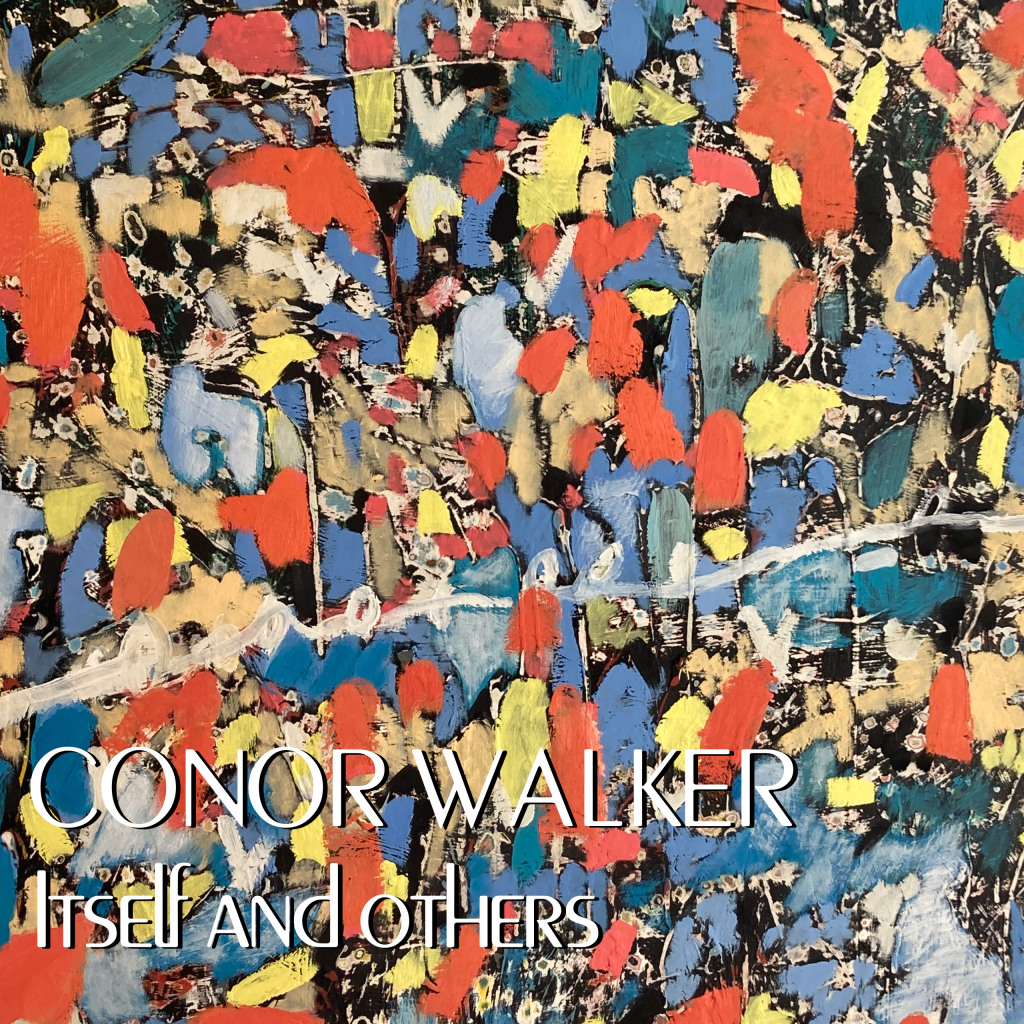
I gave the text a shadow as the white was too prominent and changed the EP name to ‘Itself and Others’. This is my final Cover art. I really like this final result as it does really work well with the fully acoustic feel. It’s an old abstract 70’s inspired cover art that I think really captures the whole theme of the EP. I love the messiness of the artwork and the use of vibrant colours. I made sure to slightly fade the text into the painting so it didn’t look too digital and more like it’s a part of the painting itself.
